Amazon Product Page Redesign

Amazon Product Page Redesign

The Amazon product page treats every piece of information as equally urgent. Grounded in user research with 15 frequent shoppers, this redesign translates customer feedback into interaction flows that reduce decision friction at the point of highest purchase intent. Each structural decision was documented with rationale to communicate clearly across design, engineering, and stakeholder contexts.

The Amazon product page treats every piece of information as equally urgent. Grounded in user research with 15 frequent shoppers, this redesign translates customer feedback into interaction flows that reduce decision friction at the point of highest purchase intent. Each structural decision was documented with rationale to communicate clearly across design, engineering, and stakeholder contexts.
Tool/
Figma
Duration/
6 Weeks
Information Architecture
User research

4

structural decision

3

screens redesigned

15

users surveyed

1

navigation pattern replaced

You open a product you already want to buy. You've basically decided.


And then the page happens.


Three prices. Two identical CTAs. Trust badges before you've picked a size. A 30-second decision becomes 3 minutes.

You open a product you already want to buy. You've basically decided.


And then the page happens.


Three prices. Two identical CTAs. Trust badges before you've picked a size. A 30-second decision becomes 3 minutes.

/Problem Statement

Amazon's mobile product page does not distinguish between information needed to make a decision and information needed to confirm one, resulting in decision friction at the point of highest purchase intent.

Amazon's mobile product page does not distinguish between information needed to make a decision and information needed to confirm one, resulting in decision friction at the point of highest purchase intent.

The product page isn't broken — it's designed like every piece of information is equally urgent. I conducted a user research study with 15 frequent Amazon mobile shoppers before opening Figma — identifying friction points at the moment of highest purchase intent. The findings:

The product page isn't broken — it's designed like every piece of information is equally urgent. I conducted a user research study with 15 frequent Amazon mobile shoppers before opening Figma — identifying friction points at the moment of highest purchase intent. The findings:

71%

scrolled back and forth before buying — not to reconsider, to double-check something the page hadn't confirmed.

40%

cited price confusion as a top friction point

40%

found reviews hard to use as a decision tool

46.7%

close the app and come back later — the same number who switch to a competitor

They didn't struggle with what to buy. They struggled with feeling sure enough to actually do it.

They didn't struggle with what to buy. They struggled with feeling sure enough to actually do it.

How I Thought Through It

Before touching Figma, I mapped the page as a decision flow — not a content layout. One question drove everything: what does the user need to decide here, and what's the minimum they need to do it?


That gave me 4 rules before any visual work:

Before touching Figma, I mapped the page as a decision flow — not a content layout. One question drove everything: what does the user need to decide here, and what's the minimum they need to do it?


That gave me 4 rules before any visual work:

Decisions before content

sequence information, don't trim it

One primary action at a time

no competing choices at critical moments

Strong feedback at risky moments

size selection, pricing, CTAs

Delay interruptions

offers and upsells appear after intent is clear, not before
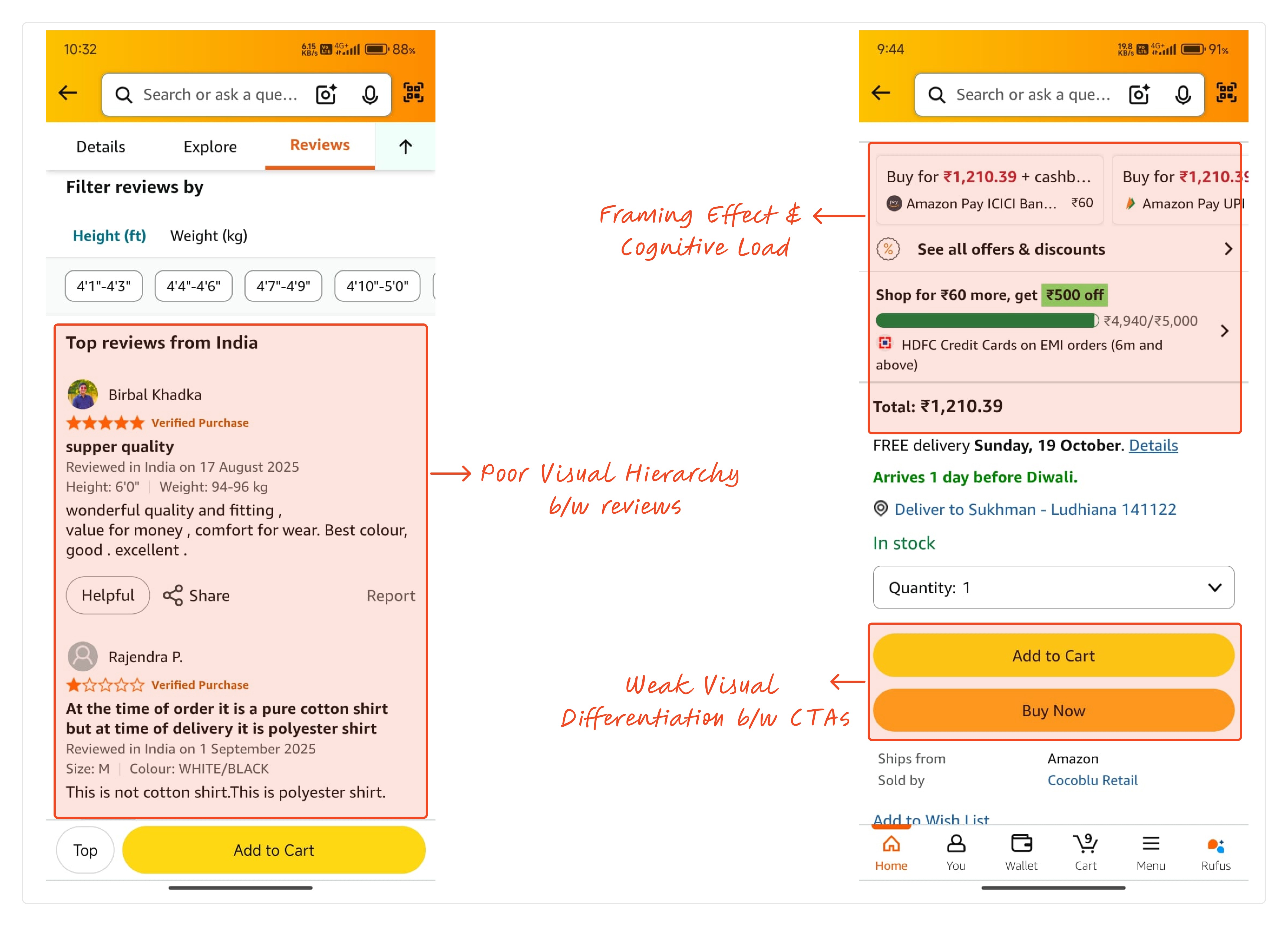
From those rules I sketched five screens in lo-fi, each answering one question. Each screen maps to a distinct interaction pattern — progressive disclosure for Details, filterable content for Reviews, and confirmation-stage grouping for Delivery Info.

From those rules I sketched five screens in lo-fi, each answering one question. Each screen maps to a distinct interaction pattern — progressive disclosure for Details, filterable content for Reviews, and confirmation-stage grouping for Delivery Info.

Then the hard calls:

Then the hard calls:

Tabs vs. scroll

/saw

One scroll treats everything as equally urgent — GST fields before you've picked a size

/Considered

Reorder the scroll — same problem, just rearranged

/chose

Tabs. Each has one job — understand / build confidence / confirm

/tradeoff

Users looking for offers early might not find them

Offers moved to Delivery Info

/saw

Cashback, GST, EMI interrupting before size is picked

/Considered

Keep it in the scroll, just lower

/chose

Moved to its own tab. Confirmation-stage info at the confirmation stage.

/tradeoff

Users who check offers first have to find the tab

Image at half the screen

/saw

Specs and price loading before you've even seen the product

/Considered

Smaller image, more info above the fold

/chose

Image takes half the screen first. For a physical product, that's the first decision input

/tradeoff

Less info visible on load (but wrong info visible early is worse)
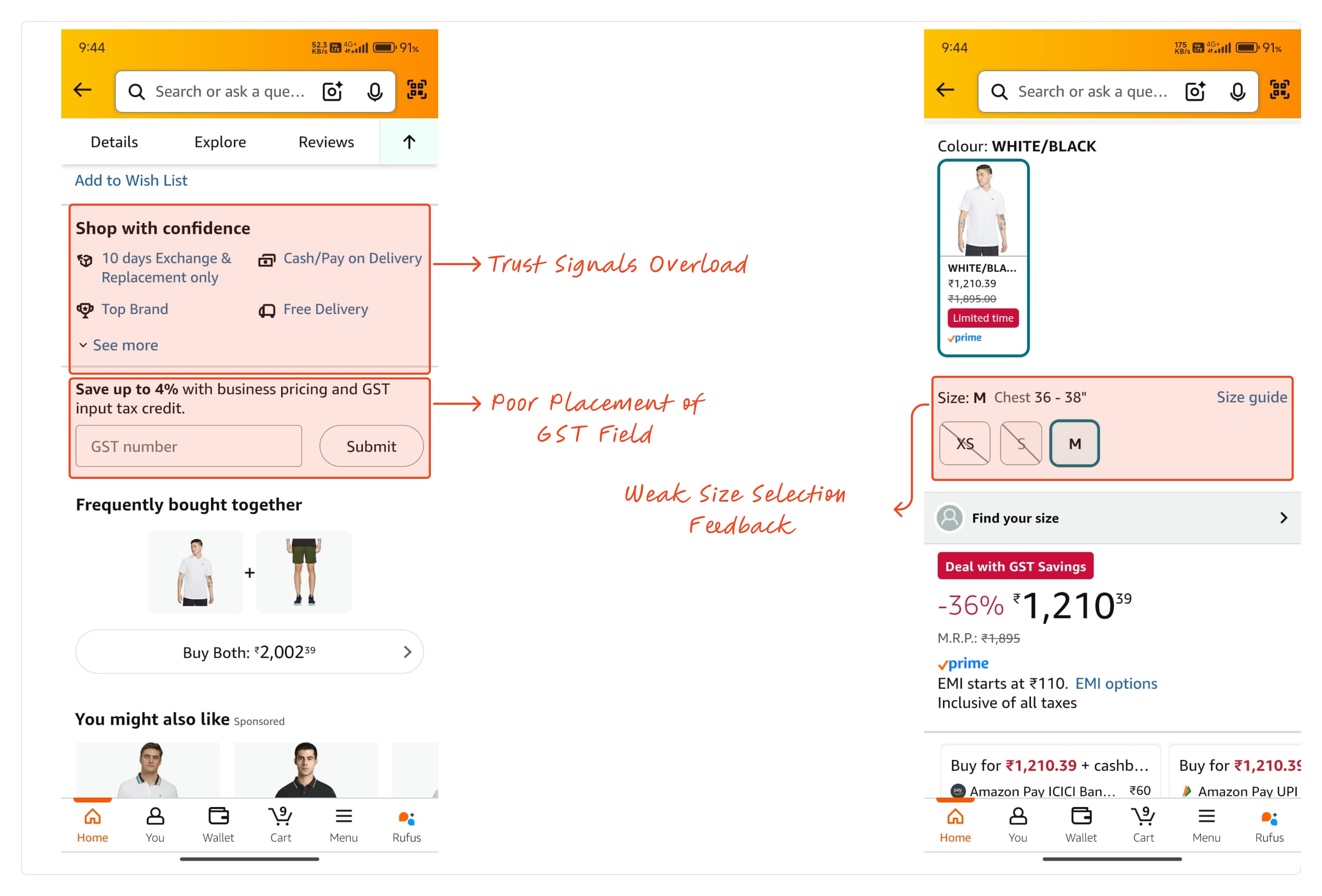
What I Built

/Home

/details

/reviews

/shipping

Image first, roughly half the screen. Below: brand, name, rating, one price, delivery date, size chips, color selector. Selected size uses both highlight state and label — not color alone. Chosen variant confirms inline so you never scroll back up to verify your tap.

Key Features and Specifications are collapsed accordions. Nothing here asks you to decide anything — it's for users who want more before moving on. Keeping it low-stakes meant decision-critical information stays on Home, not buried here.

Leads with a star distribution chart — 56% five-star, 19% one-star tells you something immediately. One-line sentiment summary below. Filter chips: All Reviews, With Photos, With Videos. Confident opinion in under 10 seconds, no full review needed.

Offers, cashback, GST, EMI, seller details — all here, reached when you're ready to confirm. Not hidden. Just in the right order.

Results

Every structural change maps directly to a named frustration from the research:

  • Price confusion → one number, no mental math

  • No variant feedback → selected state + inline confirmation

  • Unscannable reviews → distribution chart and sentiment summary lead the tab

  • Offers interrupting too early → consolidated into Delivery Info tab


No post-launch metrics — this was self-initiated with no testing after design. But the documentation structure throughout — problem, decision, tradeoff — is designed so any PM, engineer, or stakeholder can follow the reasoning without a walkthrough.

Explore the Design

The full Figma file is open to view — includes component library, hi-fi mockups, and annotated interaction specs built for developer handoff.

The full Figma file is open to view — includes component library, hi-fi mockups, and annotated interaction specs built for developer handoff.

What I'd Do Differently

I'd test at two points I skipped — after lo-fi, before committing to the tab structure, and after hi-fi, before calling it done. The research told me where people dropped off on the original. It couldn't tell me whether my solutions actually fixed it. I treated research as a substitute for testing, and it isn't. In a team environment, this is where I'd bring in engineering and PM partners early — usability testing is most effective when aligned with build constraints.

I'd test at two points I skipped — after lo-fi, before committing to the tab structure, and after hi-fi, before calling it done. The research told me where people dropped off on the original. It couldn't tell me whether my solutions actually fixed it. I treated research as a substitute for testing, and it isn't. In a team environment, this is where I'd bring in engineering and PM partners early — usability testing is most effective when aligned with build constraints.

The biggest gap between research and good design isn't insight,
it's knowing what to do with it structurally.

Create a free website with Framer, the website builder loved by startups, designers and agencies.