


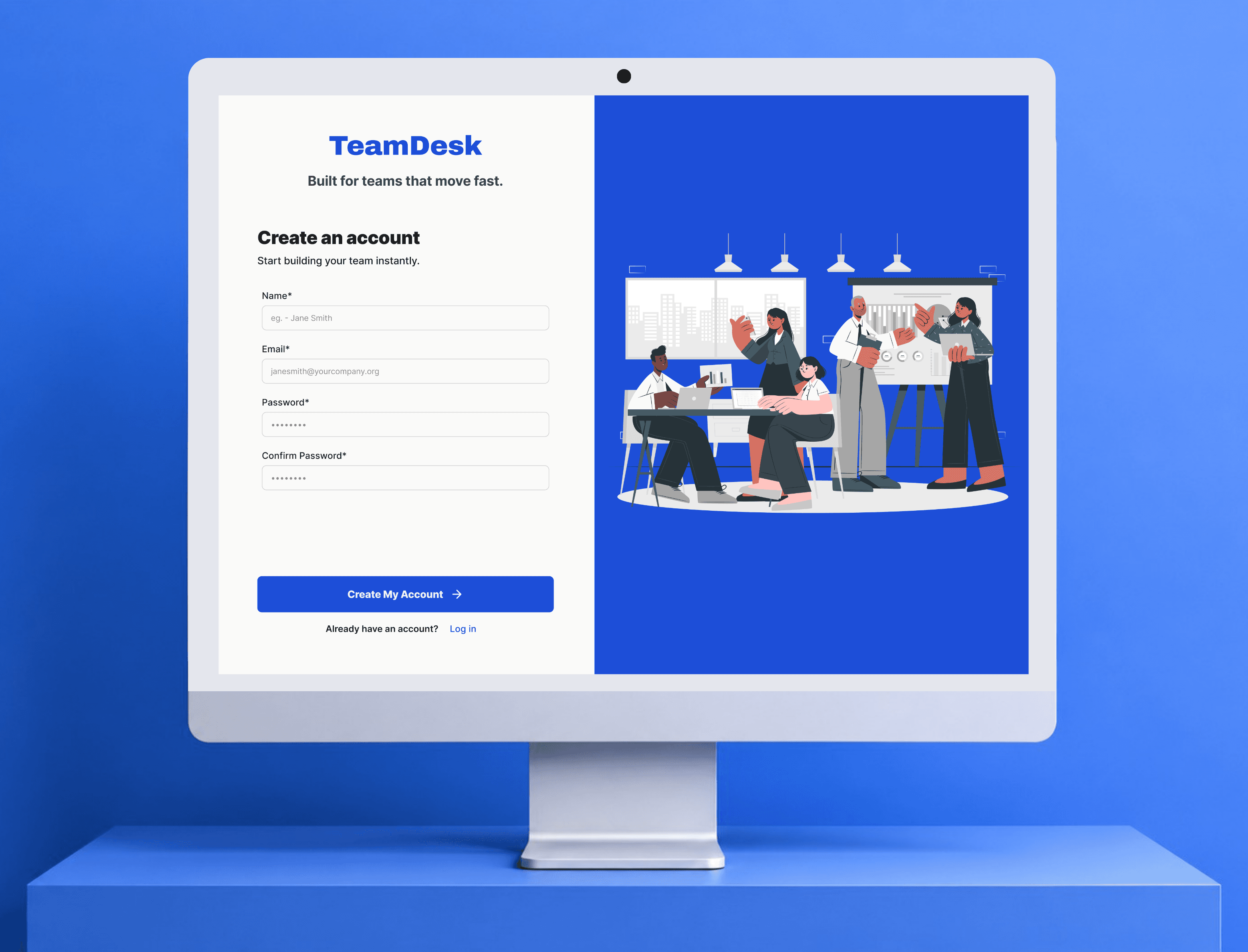
Tool/
Figma, Claude
Duration/
8 Weeks
Role/
Solo UI-UX Designer
At my internship at Uzence Design Studio, an 8-person team using ClickUp, I struggled to find my team and tasks among features we never used. Everyone I spoke to felt the same.
The alternatives were either basic to-do lists or another ClickUp. Nothing built for small teams. So I decided to build the thing in between. Here's the outcome -
90%
got what the app does without any explanation
95%
could set it up on their own
90%
spotted task ownership at a glance
/Explore the Design
/the problem
Most task tools are built for scale. Complex workflows, large orgs, dedicated project managers. Small teams get handed the same thing with no real fit.
I surveyed 21 people actively using task management tools. ClickUp was the most used at 33%. Most were on teams of 6-15 people — exactly the size that falls through the gap. The top two complaints were consistent: too many features they never used, and overkill for their team size.


I just wanted to track tasks, but there were too many options.
Honestly, it felt too complex for what our small team needed.
And when I asked if they'd try a simpler, more focused tool built specifically for small teams — 81% said yes. Just not another feature-heavy tool, but something that solves the actual problem first.
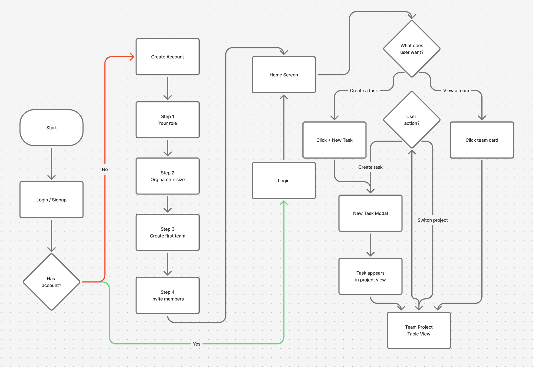
/how i thought through it
I mapped ClickUp, Asana, and Monday — what each did well, where small teams consistently dropped off.

Three problems kept coming up - too many features on first load, ownership buried (hard to see who's doing what), mobile treated as an afterthought.
That gave me a clear direction. Before opening Figma, I decided what TeamDesk would never have.
💬 Threaded comments
Small teams already have Slack or WhatsApp for that. v1 didn't need to solve collaboration.
📁 File attachments
Adds storage, versioning, pricing complexity. Not the problem we're solving right now.
🙋🏻♀️ Granular permissions
6-10 people don't need five permission levels. Owner and Member is enough.
🔔 Notifications
Real cut, not an oversight. Wanted v1 to prove the core first.
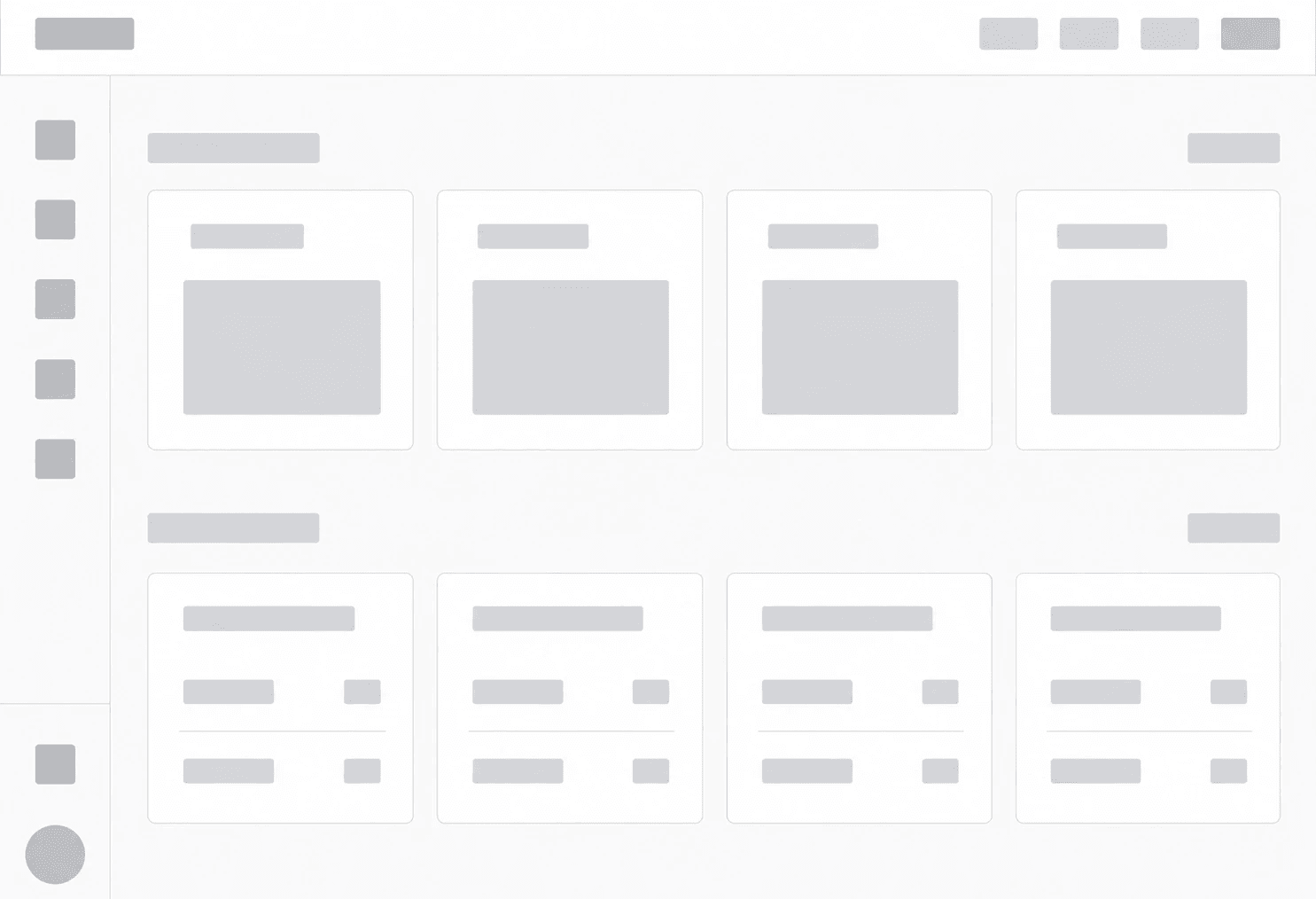
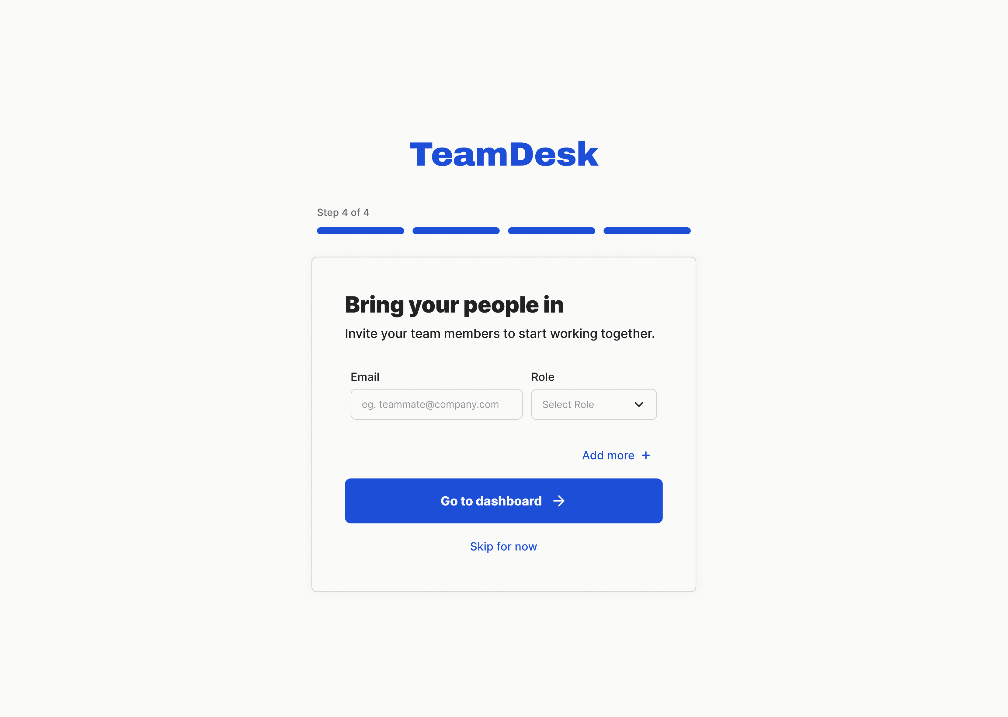
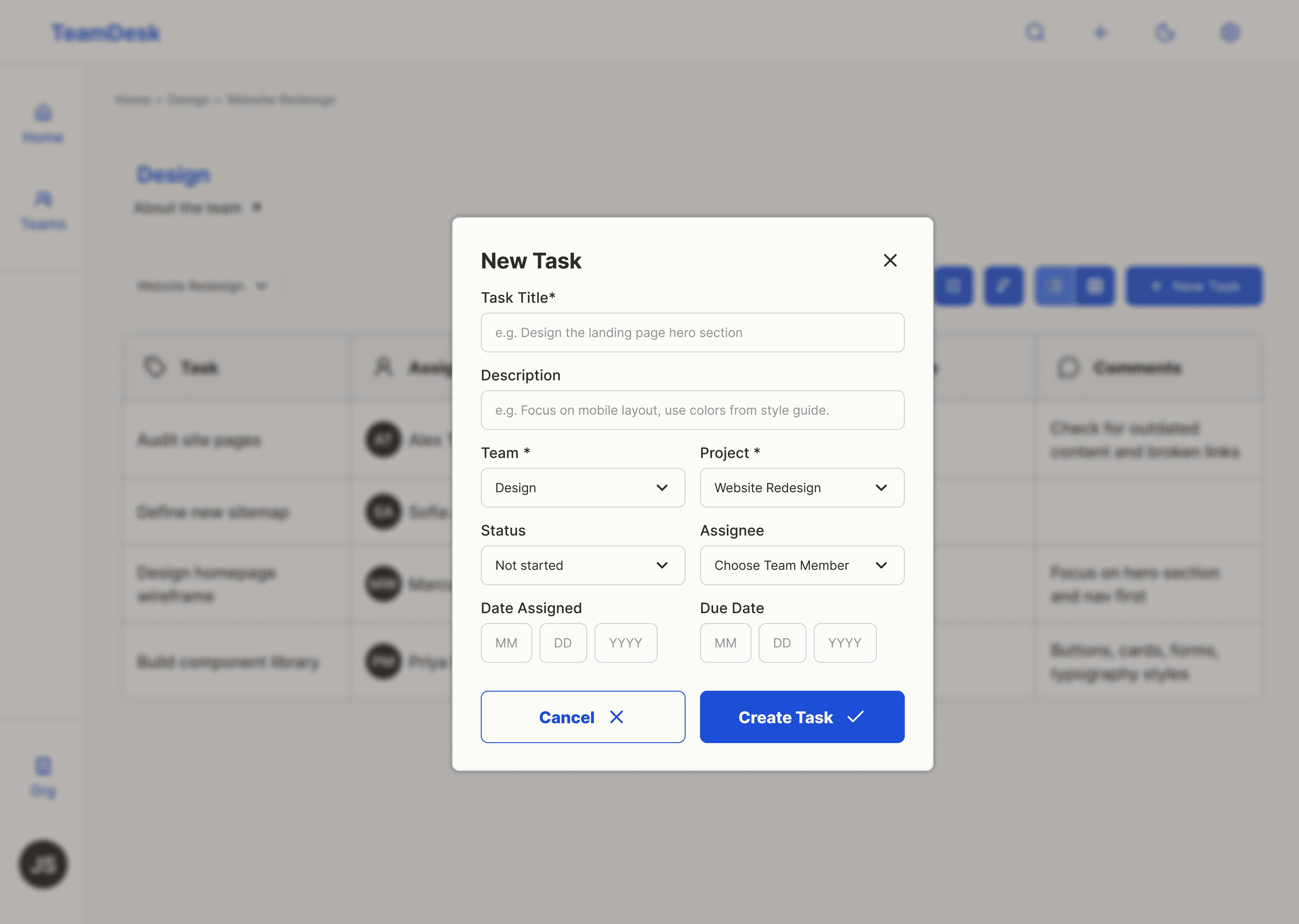
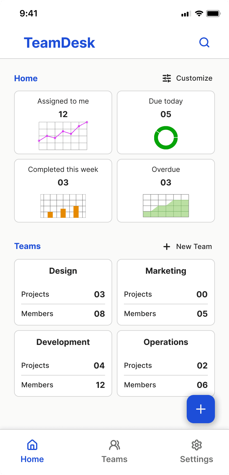
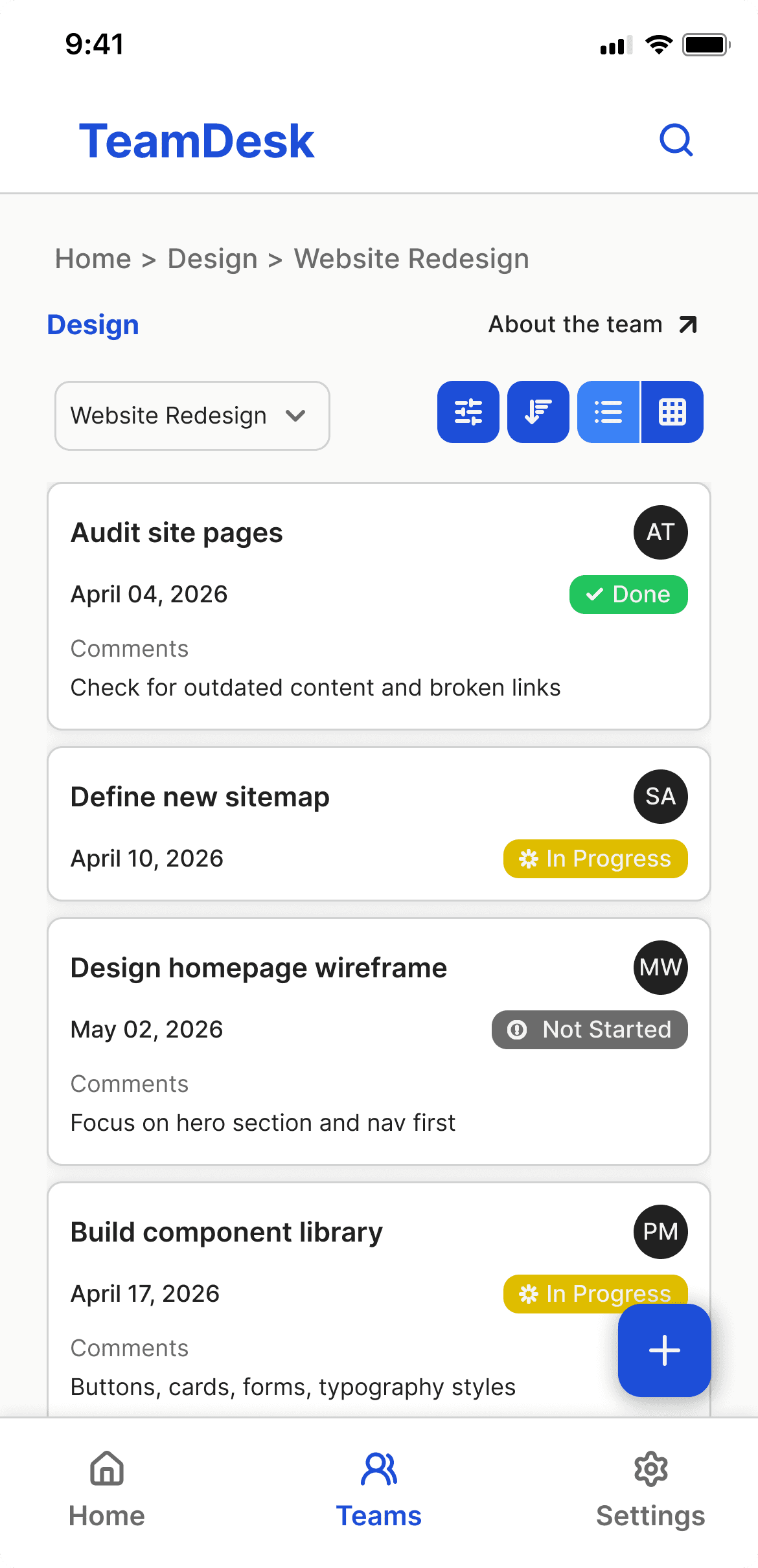
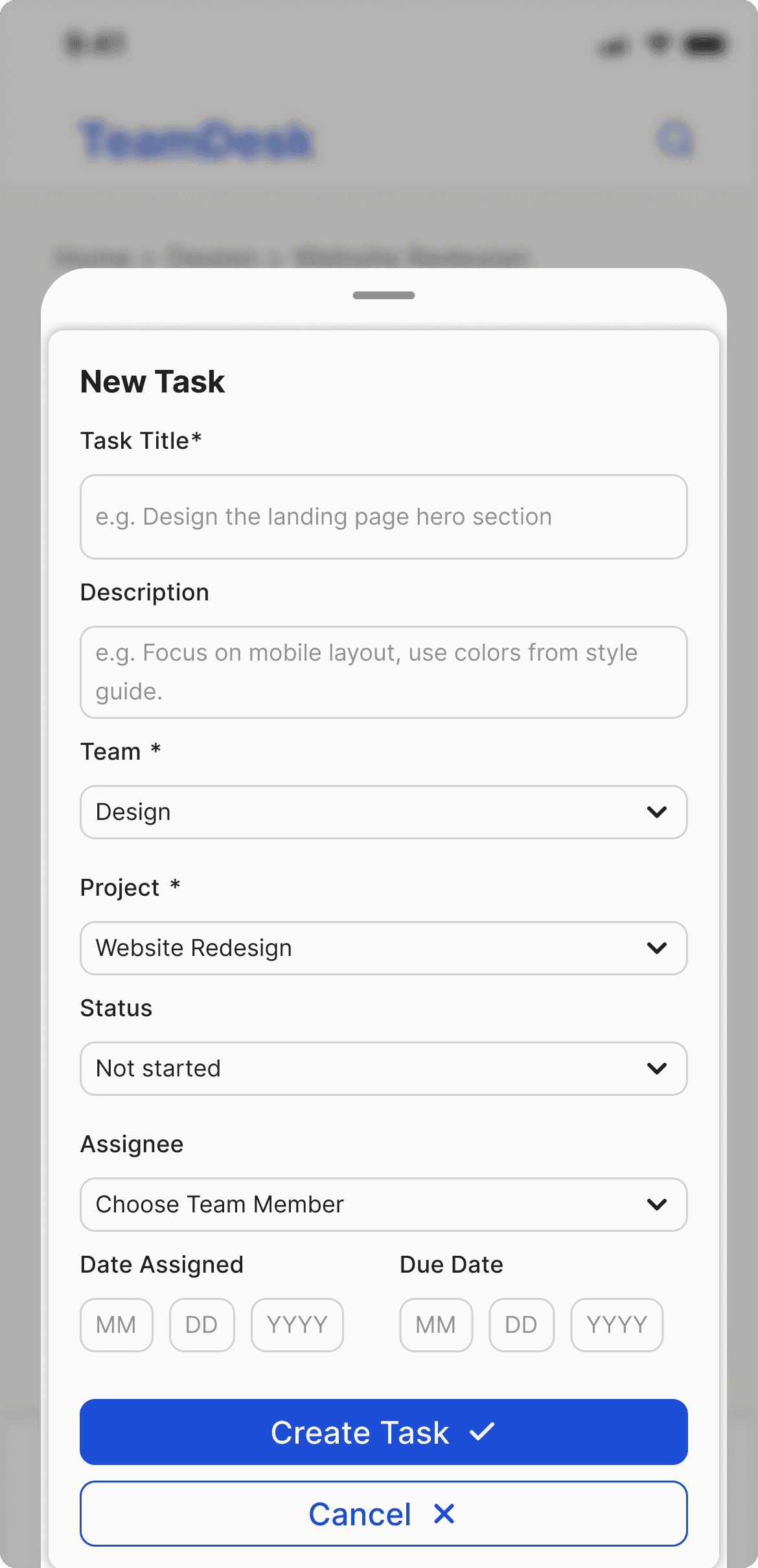
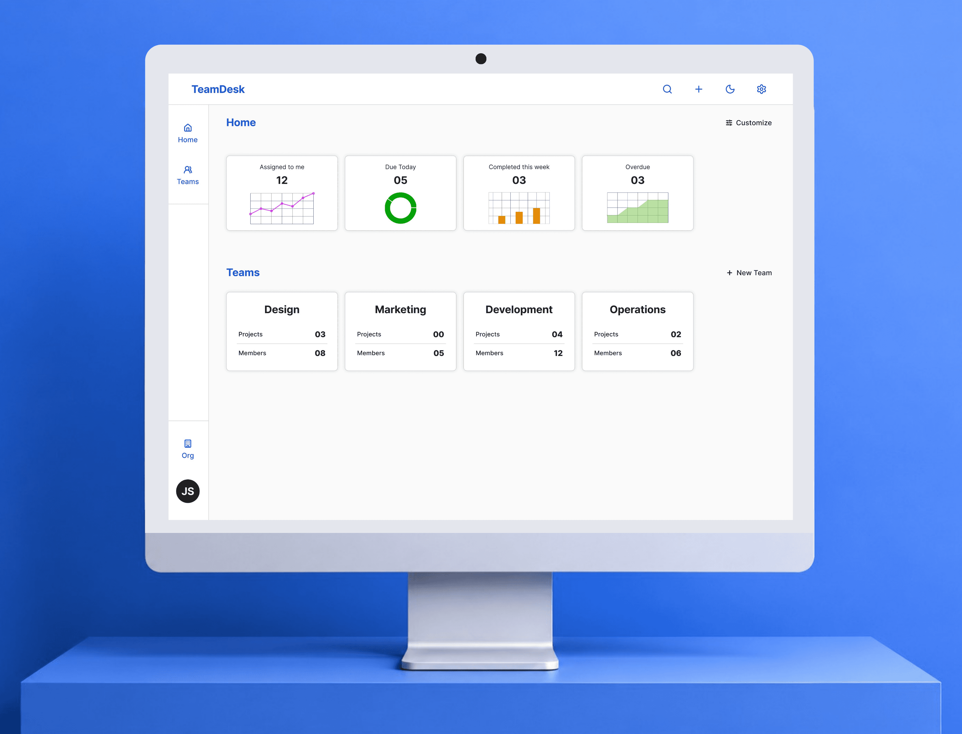
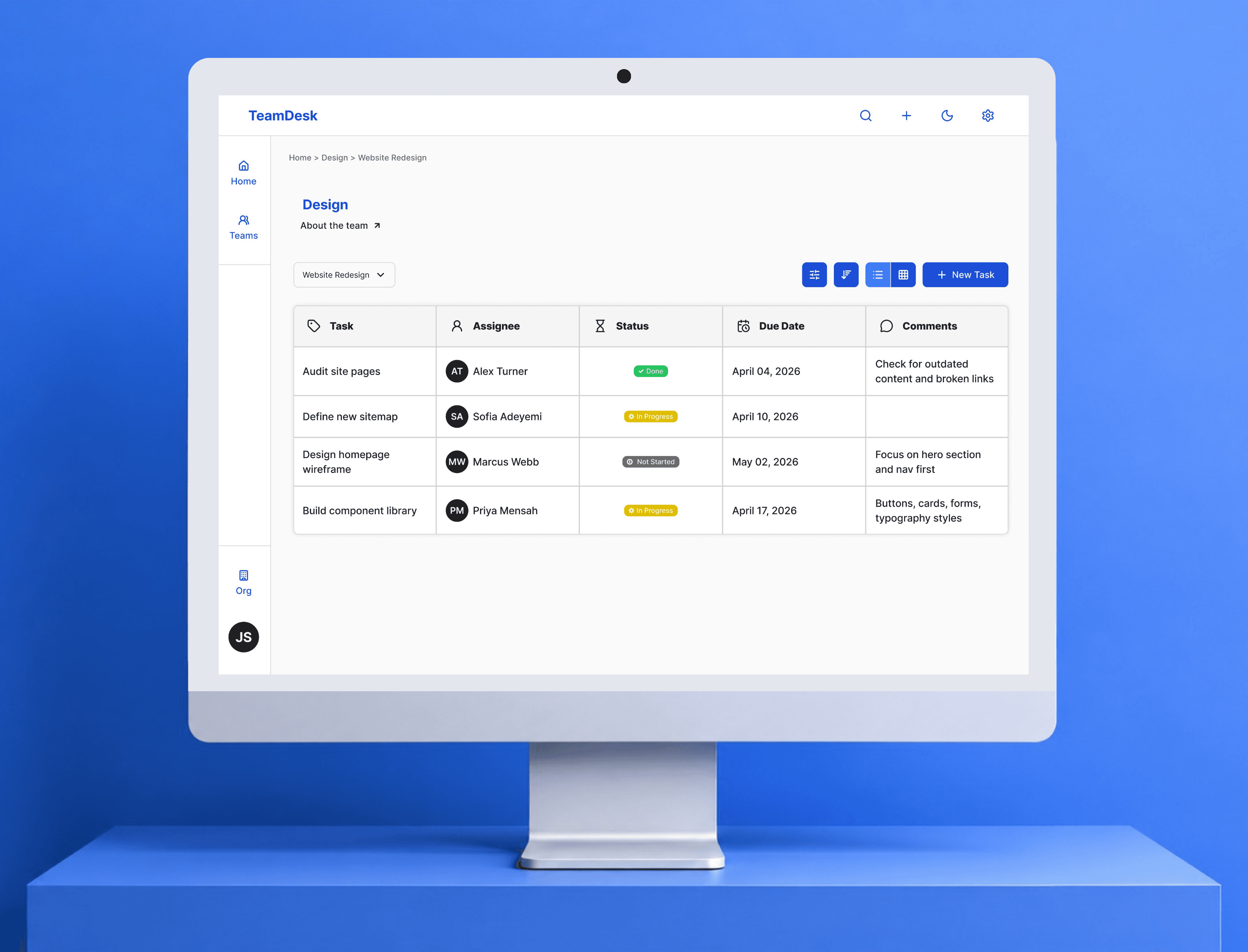
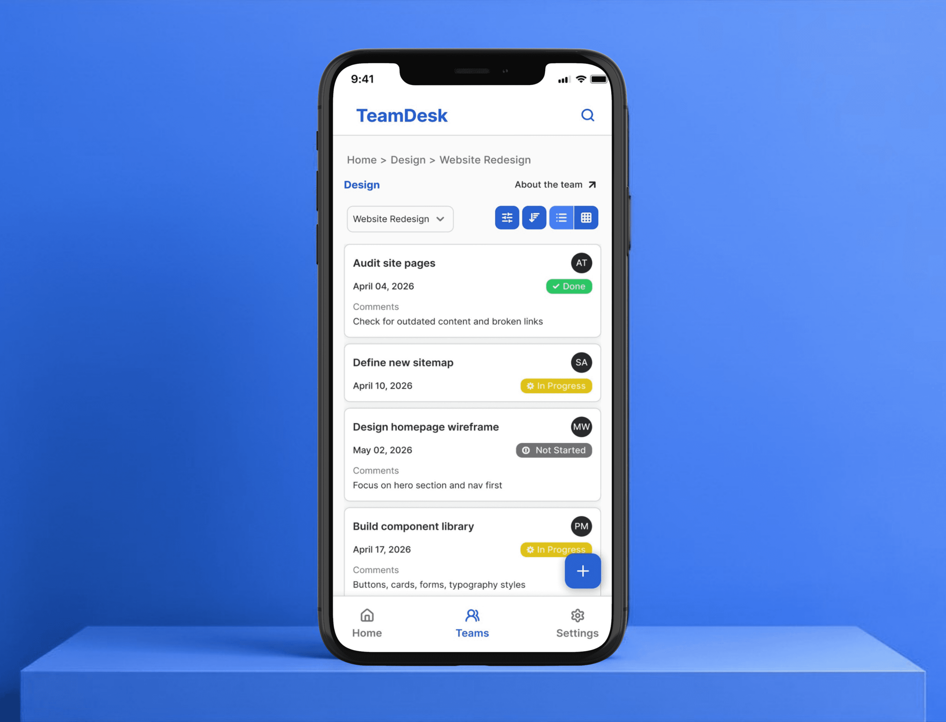
Then the structure. Three levels: teams, projects, tasks. Teams are your departments or groups. Projects are what those teams are working on. Tasks are the actual work, with an owner, a status, a due date (example: Home → Design → Website Redesign).
That decided the layout direction for which I explored three options with Claude.


Wide sidebar cluttered past 4 projects. No sidebar collapsed the hierarchy. Icon rail won.
From there the structure was clear. Home shows the org — what's assigned, what's due, what's overdue. Task lists live inside projects.
/Design System
Before touching any screens, I built the system first and every decision had a reason behind it.

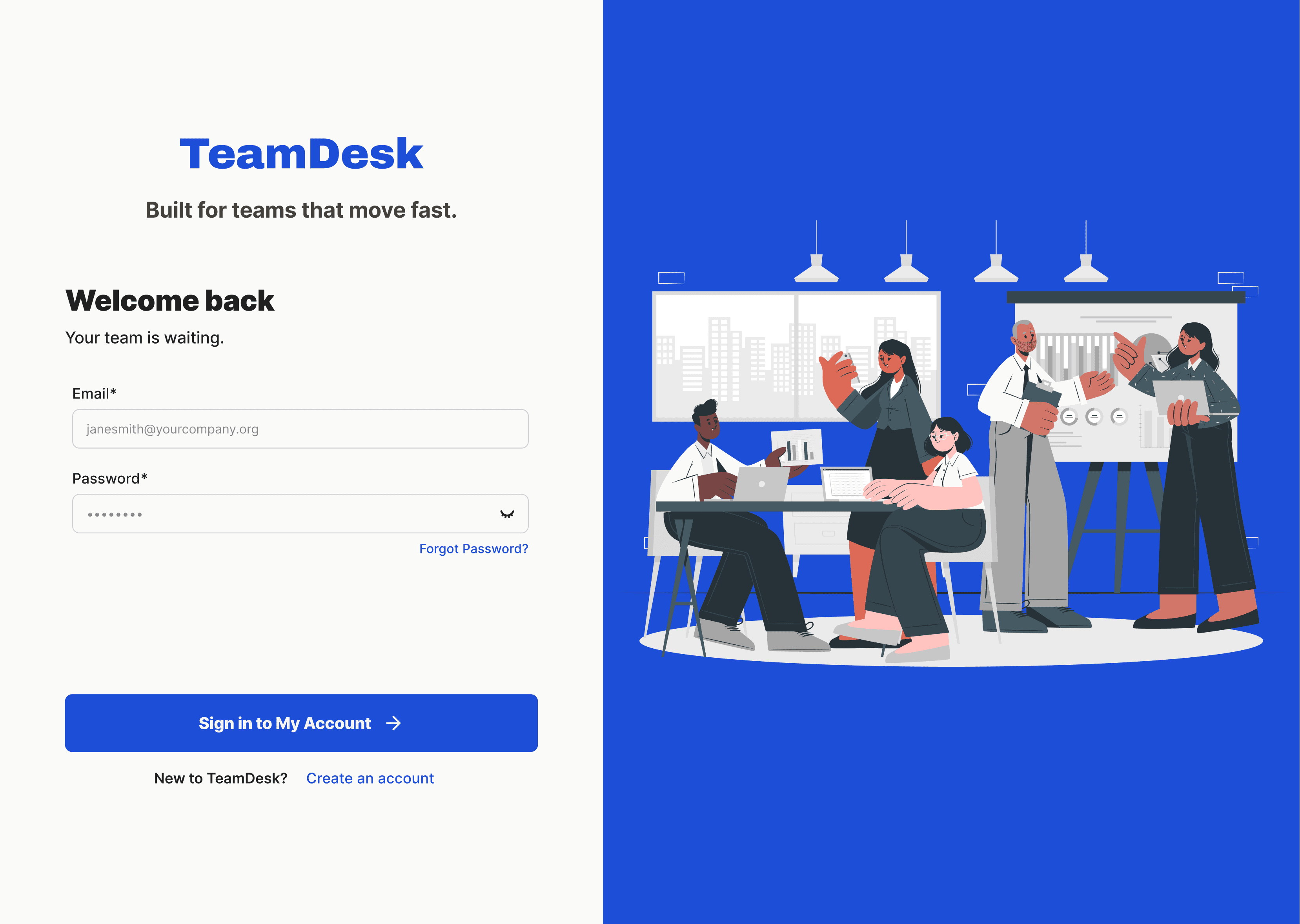
Inter for typography
Many task tools go too branded. I wanted something neutral enough that the content leads, not the type.
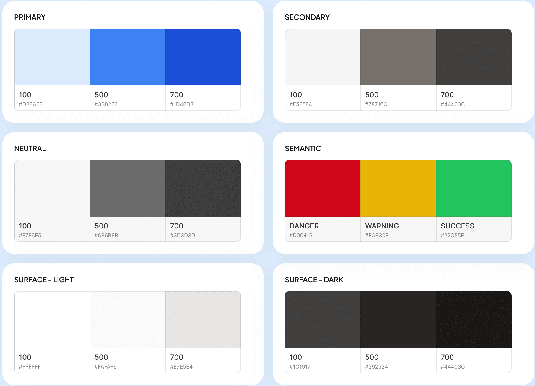
Blue as primary color
Industry standard for SaaS. Ops and marketing teams want something that feels reliable, not colorful.
8pt grid throughout
Set this before touching any screens. Easier to stay consistent than fix inconsistency later.
Then the component library. Every button, input, modal, dropdown — all defined before a single screen was designed. And the name "TeamDesk" simply because it felt grounded and practical. Something a small team actually sits around and gets work done at. Just a desk.

/final design


/results
90%
got what the app does without any explanation
95%
could set it up on their own
90%
spotted task ownership at a glance
Nobody said it felt overwhelming. Nobody said they couldn't figure it out. That was the whole point.
/What I'd do differently